A Data Scientist is the one who not only knows how to use machine learning but the one who knows when to avoid it.
Today, I will stand on the shoulder of a giant i.e. John Tukey, the father of exploratory data analysis(EDA). Often, in a hurry to fit a machine learning model, people usually ignore the important step of Data Analysis. Hence, it is quite possible that they might end up using ML where it may be overkill; usually seen amongst beginners. In this article, we will explain on this with two simple datasets viz. Iris and Haberman.
Also read: Motivating Data Science with Azure Machine Learning Studio
The Iris Dataset
Iris is an ideal dataset to introduce a student to data analytics. First created by RA Fischer, this dataset has 150 samples distributed amongst 3 classes of flowers viz. Setosa, Virginica and Versicolor. Further, it has 4 features viz. petal length, petal width, sepal length, and sepal width. Let us load the data into a pandas dataframe.
import pandas as pd
import seaborn as sns
import matplotlib.pyplot as plt
import numpy as np

Iris = pd.read_csv("iris.csv")
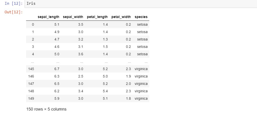
The last column ‘species’ is the target variable i.e. the label to be classified. A newbie to data analytics might be tempted to attack this problem with some kind of classification algorithm. However, it is always advisable to hold your horses and take a ‘look’ at the data first. Hence, let’s do some exploratory data analysis.
Univariate analysis.
Univariate analysis typically comprises PDF’s and CDF’s and Box plots. Let us draw the three of them to uncover some insights on the Iris dataset.
#Using Seaborn we create a distribution of Petal Length
sns.FacetGrid(Iris, hue="species", size=5) \
.map(sns.distplot, "petal_length") \
.add_legend();
plt.show();
This gives us a distribution plot of the column petal length, which is as follows.
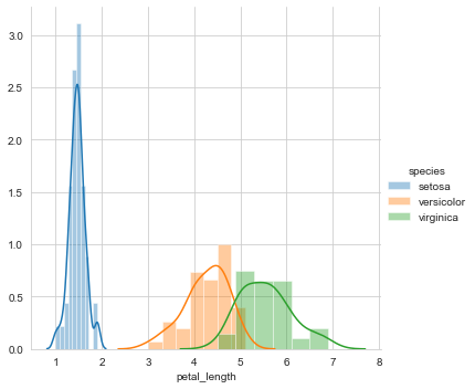
A first look at the distribution of petal length reveals that setosa is linearly separable from the other two classes viz. versicolor and virginica. Hence, it can be classified with a simple if-else condition like petal_length<=2.
However, there is some overlap between versicolor and virginica. To classify a flower as versicolor or virginica in the overlapping region, we need to determine the probability that the flower is versicolor or virginica. Hence, let us plot the CDF of petal length.
import numpy as np

Iris_setosa = Iris.loc[Iris["species"] == "setosa"]
Iris_virginica = Iris.loc[Iris["species"] == "virginica"]
Iris_versicolor = Iris.loc[Iris["species"] == "versicolor"]
counts, bin_edges = np.histogram(Iris_setosa['petal_length'], bins=10,
                                 density = True)
pdf = counts/(sum(counts))
cdf = np.cumsum(pdf)
plt.plot(bin_edges[1:], cdf, label = 'setosa')

counts, bin_edges = np.histogram(Iris_virginica['petal_length'], bins=10,
                                 density = True)
pdf = counts/(sum(counts))
cdf = np.cumsum(pdf)
plt.plot(bin_edges[1:], cdf, label = 'virginica')

counts, bin_edges = np.histogram(Iris_versicolor['petal_length'], bins=10,
                                 density = True)
pdf = counts/(sum(counts))
cdf = np.cumsum(pdf)
plt.plot(bin_edges[1:], cdf, label = 'versicolor')

plt.legend()
plt.show();
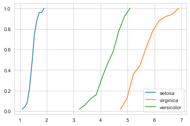
The above figure gives us the CDF of the petal length for all the three classes. Let us consider a particular flower with a petal_lenth of 5. A keen look reveals that the probability of that flower being versicolor is 0.8, while the probability of the flower being virginica is 0.2.
Nonetheless, this dataset is fairly easy and linearly separable. With some data cleansing and a few conditional statements, we can classify the three flowers without using ML. However, to appreciate the importance of stochastic analysis and later on, Machine Learning, let us go through another dataset named Haberman’s dataset.
The Haberman Dataset
The Haberman’s dataset is a breast cancer survival dataset. It studies the survival of patients after undergoing breast cancer surgery. Let us load the data first.
import pandas as pd
import seaborn as sns
import matplotlib.pyplot as plt
import numpy as np

Haberman = pd.read_csv("haberman.csv")
Haberman
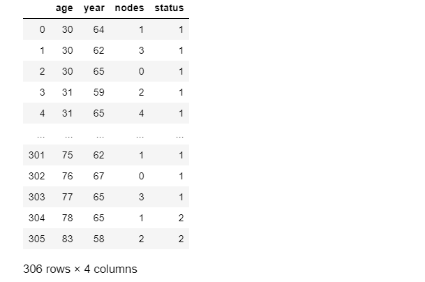
In this dataset, the features are age, year and nodes, while the label is status. The ‘status’ comprises values i.e. 1 and 2.
1= patient survived after 5 years
2= patient died after 5 years
Now, let us do some ‘label’ engineering and transform the values 1 and 2 into the binary values ‘Survived’ and ‘Died’.
Haberman.loc[(Haberman['status'] == 1), 'status'] = 'Survived'
Haberman.loc[(Haberman['status'] == 2), 'status'] = 'Died'
The transformed data is as follows.
![]()
Now, let us start with univariate analysis of the dataset.
Univariate Analysis
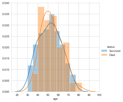
Firstly, let’s plot the distribution of the feature ‘age’.
#pdf of age
sns.FacetGrid(Haberman, hue="status", size=5) \
.map(sns.distplot, "age") \
.add_legend();
plt.show();
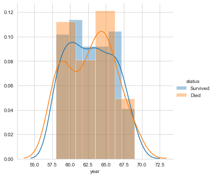
Next, let’s plot the distribution for the variable year.
#pdf of year

sns.FacetGrid(Haberman, hue="status", size=5) \
.map(sns.distplot, "year") \
.add_legend();
plt.show();
Finally, let’s plot the distribution of the number of nodes
#pdf of nodes

sns.FacetGrid(Haberman, hue="status", size=10) \
.map(sns.distplot, "nodes") \
.add_legend();
plt.show();
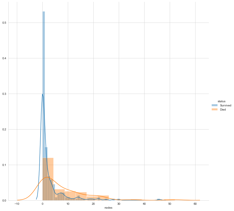
The above three plots clarify that none of the features makes the two labels linearly separable. However, can a combination of variables make them linearly separable? Let us perform bivariate analysis.
Bivariate Analysis
If the number of features is less, pair plots are the best form of bivariate analysis. Let us plot the pair plot.
sns.set_style("whitegrid");
sns.pairplot(Haberman, hue="status", size=3,vars=['age', 'year', 'nodes']);
plt.show()
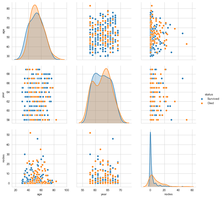
One can clearly see that even a combination of variables does not make the labels linearly separable. We can go on with different visualisations. However, isn’t this sufficient motivation to go further with Stochastic Analysis and eventually Machine Learning?