
It is a classic saying that a picture is better than thousand words. Therefore, an entire discipline of data visualization stands on this statement, since humans prefer visual information over plain text/numbers. Not only are visuals attractive and intuitive, but also precise. Thus, unsurprisingly, the market is replete with a plethora of visualisation tools with Microsoft PowerBI being one amongst them.
PowerBI comes with a host of options to create compelling visuals. Let us explore the feature of conditional formatting in this article.
Motivating Conditional Formatting in PowerBI
One of the most commonly used visual in data visualization is the table. However, it is always eye-catching if we use appropriate colour coding for the data in tabular format. Let us try to understand this with a scenario.
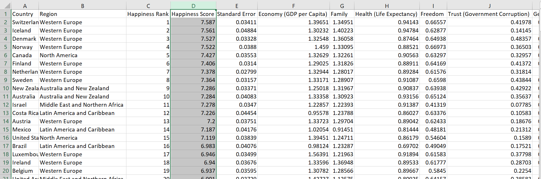
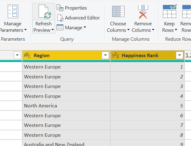
Let us use the world happiness index data for different countries from kaggle. This dataset is a year-wise measurement of happiness index of different countries across the world.
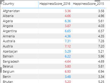
Similar data exists for 2016-2019. However, what if we want to compare and contrast the happiness score for every country for 2015 and 2016 data? To elaborate, what if we want to highlight an increase/decrease in a country’s Happiness Score for 2015 and 2016 with different colours? For a better understanding let me give you spoiler of the final dashboard as shown below.
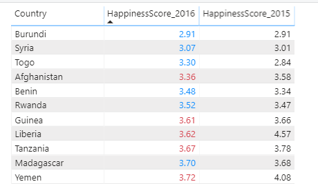
In the above image, if the Score for 2016 is equal to or greater than 2015, it’s highlighted in blue, while if 2016 score is lesser than 2015, it is marked red. So, how is this possible? The answer lies in conditional formatting. Let us walk through a simple demo to recreate this view.
Step 1: Import Data
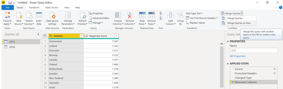
For our demo purposes, we will use two columns viz. Country and Happiness Score from 2015 and 2016 years data. Let us use the Get Data wizard to import the two csv files containing the 2-year data as required.
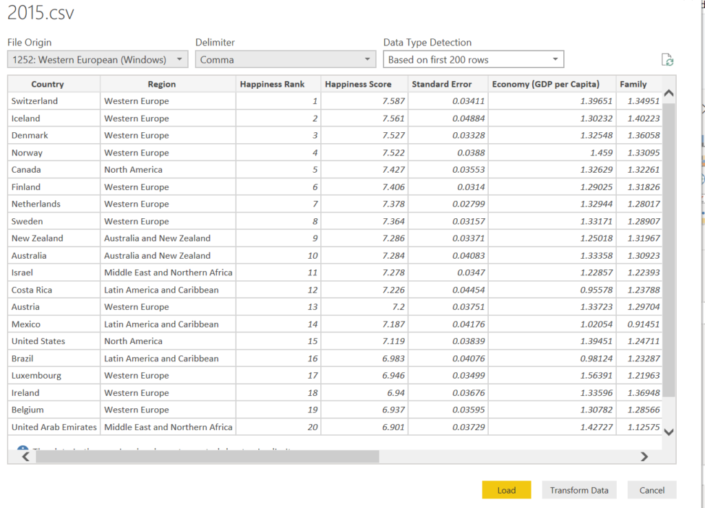
This brings us to the preview of the data.
Click on Transform Data.
Step 2: Transform Data
After importing the two excel files, we need to transform the data. Select all the unnecessary columns and click on Remove Columns.
Once you have data for both 2015 and 2016, join the two. To achieve this, click on edit queries. Furthermore, click on Merge Queries as New.
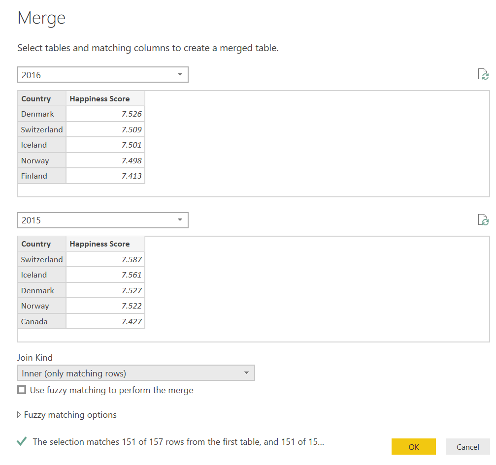
We will perform the inner join based on the country as shown below.
After this, you will get a view like this.
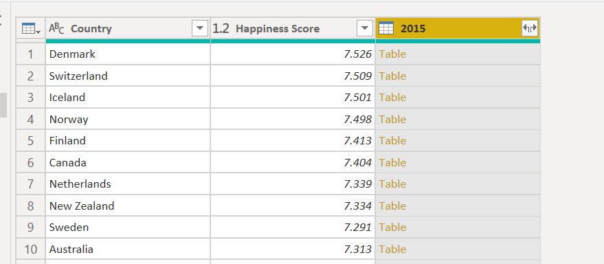
Please note that while expanding in 2015, we have to exclude the country column to avoid duplicates.
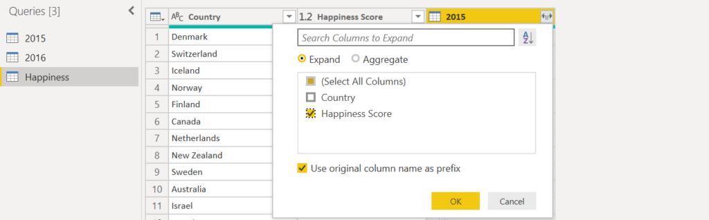
This will give you the requisite data. Please take care of renaming columns and default summarizations.
Step 3: Creating Visual and conditional formatting.
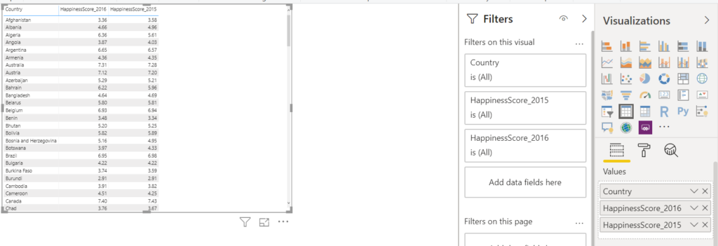
Once you have the data ready, select the three columns, and click on the table visual. This will give you a view as shown below.
Now, in order to get the colour coding as shown in the spoiler, we need to create a calculated column called Format Hour. The calculation goes as follows.
FormatIndex = IF(ROUND([HappinessScore_2015],2)>ROUND([HappinessScore_2016],2),0,1)
This column will contain the value 0 where HappinessScore_2016 is less than HappinessScore_2015 while it will contain the value 1 when the converse is true.
Furthermore, right-click on the column HappinessScore_2016 and select Conditional Formatting>Font Colour.
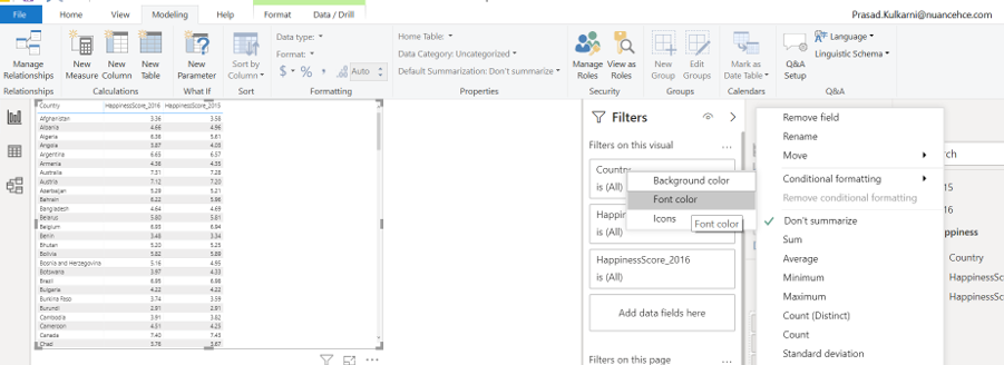
Define the rules as shown below.
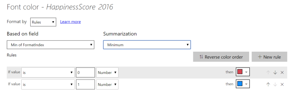
Click OK and bingo! you have your PowerBI dashboard ready.
Also Read: An Introduction to Azure IoT with Machine Learning