
In Data Science, Exploratory Data Analysis is an essential process. And as they say, a picture is better than thousand words, visual tools play a key role in understanding the data at hand. As John Tukey said, the greatest value of a picture is when it forces us to notice what we never expected to see. Fast forward to state-of-the-art Data Science, new tools are emerging every day to ease the process of Data Analysis and Knowledge discovery. In python, we have the popular matplotlib and seaborn. However, Plotly is gradually making its way ahead of every other tool.
While one can say that plotting tools like seaborn, matplotlib or plotly can work with data structures like numpy arrays. But, it is helpful if the dataframe API gives basic plotting capabilities built-in. So, how do data manipulation tools work with plotting tools?
Now let’s take a detour. To explore data, we need to load the data into a data manipulation tool/library. The most famous data manipulation tool is Pandas. However, it works in a single node setting as opposed to Pyspark. But, Pyspark does not offer plotting options like pandas. But as we wrote in an earlier article, Databricks Koalas is a middle ground between the two. So let’s tabulate the most famous options we have:
| Dataframes | Plotting |
| Pandas | matplotlib |
| Databricks Koalas | seaborn |
| pyspark | plotly |
Pandas Plotting powered by Matplotlib
The pandas library provides the plot() API in two flavours viz. pandas.series.plot() and pandas.DataFrame.plot(). A series in pandas represents a column while the Dataframe represents a table. Hence, the former API is useful in univariate analysis, while the latter is useful in bivariate analysis. Let’s perform univariate analysis using a box plot as an example. We will use the scikit learn California housing dataset.
import pandas as pd
from sklearn.datasets import fetch_california_housing        #Import Libraries

california_housing = fetch_california_housing(as_frame=True) #Fetch Data

pd_df_california_housing = pd.DataFrame(california_housing.data, columns = california_housing.feature_names)
pd_df_california_housing['target'] = pd.Series(california_housing.target)  #Converion to Pandas Dataframe
Now, let’s plot a box plot of the column House Age:
pd_df_california_housing['HouseAge'].plot.box()
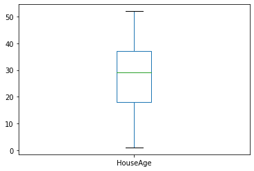
If you look at the cell, it will be clear that this plot was created using matplotlib. The plot() function is a wrapper to pyplot.plot(). This is also mentioned in the official documentation here.
Koalas Plotting powered by Plotly
Now, people working in Data Science are aware of the plotly. It is way more intuitive and interactive than matplotlib or seaborn. And, here is where Databricks koalas dataframe scores in an additional point. Not only does it work in a distributed setting like Spark, but it is also powered by plotly. Let’s plot the same example using koalas. We assume that you have installed Databricks koalas. If not, please do so.
import Databricks.koalas as ks
ks_df_california_housing = ks.from_pandas(pd_df_california_housing)   #Converting the Pandas dataframe above to Koalas
Plotting the column House Age gives us the following results:
ks_df_california_housing['HouseAge'].plot.box()
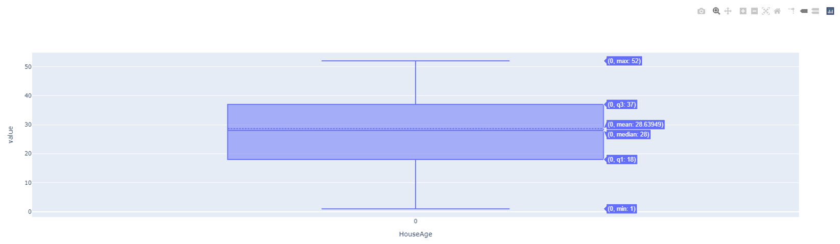
Hovering on the top right corner you will read the message Produced with Plotly. But, look at the plot and you realise it is much more interactive.
Conclusion
This is not a post to deride matplotlib, seaborn or Pandas. They are great for beginning the journey of Data Science. However, we need to evolve with time and koalas plotly are great tools.
Lastly, these tools are evolving. Follow this space to stay updated.